Apple’s new Liquid Glass design, launched with iOS 26, is gaining traction among app developers. The company just unveiled an updated gallery on its developer website showcasing how various third-party apps are embracing this sleek, fluid design language.
Liquid Glass Gains Momentum Among Developers
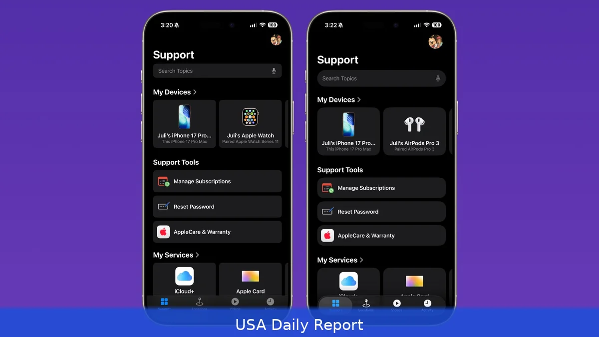
When Apple introduced iOS 26, it rolled out Liquid Glass as its fresh design language, aiming to create more natural, responsive experiences across iPhones, iPads, and Macs. Since September, developers have been busy reworking their apps to incorporate these smooth, translucent visuals.
Apple’s latest move? An updated visual gallery on its developer site that puts the spotlight on these Liquid Glass transformations. The gallery offers side-by-side comparisons showing apps before and after adopting Liquid Glass, making it clear just how much the design language changes the user experience.
“Explore a new visual gallery to find how teams of all sizes are taking advantage of the new design and Liquid Glass,” Apple says. The gallery highlights how the design works on different platforms, showing off everything from tab bars and navigation buttons to pop-out menus and search features, all adopting Liquid Glass elements.
Apps Showcased in the Gallery
Many apps feature in the gallery, illustrating how Liquid Glass adapts to different use cases.
Popular apps like Crumbl, Tide Guide, GrowPal, Lumy, Sky Guide, Linearity, LTK, CardPointers, American Airlines, Lowe’s, Photoroom, OmniFocus 4, CNN, Essayist, and Lucid Motors have embraced the look.
That said, take Linearity, for example — a vector-graphics design app now unified across iPhone, iPad, and Mac. On iPad, the app introduces a two-column Inspector that lets users browse and edit side-by-side, adjusting dynamically to window size. On iPhone, touch targets and gestures are refined for easier one-handed use.
Then there’s Crumbl, which uses Liquid Glass to highlight its brand photography. Its signature pink branding moves from the top toolbar into the content layer, letting images shine through the controls more naturally.
New Additions in the Latest Gallery Update
Apple’s newest gallery update adds fresh examples.
Carrot Weather stands out with a cleaner interface — fewer tabs in the bottom toolbar and a refined Radar tab map that benefits from Liquid Glass’s fluid design. Developer Brian Mueller even added a full musical to the app, though that’s outside the design realm.
Denim, an app for creating playlist cover art, also gets a nod. Its toolbar controls blend seamlessly into the dark canvas, and undo/redo buttons update with Liquid Glass styling. Text labels on cover art get a fresh, polished look, too.
Other apps adopting Liquid Glass recently include Tasks, GoodLinks, AllTrails, Fantastical, Kroger, SketchPro, Trello, and Le Monde. All incorporate Liquid Glass in various UI elements like tab bars, navigation buttons, and pop-out menus, aligning with Apple’s aesthetic standards.
Evolution and Future of Liquid Glass
Honestly, since its debut, Apple has tweaked Liquid Glass here and there.
For instance, the Lock Screen clock now includes a slider bar that lets users adjust the Liquid Glass effect level. But overall, the design language remains consistent across iOS 26, iPadOS 26, and macOS 26.
Rumors suggest that Apple plans to stick with Liquid Glass in the upcoming iOS 27, iPadOS 27, and macOS 27. The company might even introduce a system-wide slider for controlling Liquid Glass opacity, giving users more control over the visual effect.
Liquid Glass shows how Apple is shifting its design style toward a more fluid and immersive interface that blends content and controls. The goal isn’t just a nice look — it’s to make apps feel natural and easier to use on all devices.
Developers need to rethink their UI elements to match this style without losing usability. Apple’s gallery offers a rare peek into how different teams approach this challenge, with some focusing on simplifying navigation, others on enhancing content visibility.
For users, these changes promise more intuitive interaction and a polished look that’s consistent across the Apple ecosystem. Watching these apps evolve gives a glimpse of where interface design is headed.
Apple’s updated Liquid Glass gallery isn’t only a design showcase; it shows that more apps are adopting this sleek, fluid interface. As more apps adopt it, Liquid Glass seems likely to become a key part of Apple’s ecosystem for the foreseeable future.


